This topic contains some example
survey questions to suit specific scenarios. You can also find the JSON metadata structure built in for each type of question
below.
Default Question Metadata Shown in the Survey Designer
Full Survey Examples:
Include HTML
You can include HTML in the JSON code, provide that:
- the xtype is 'panel'
- the html has no line breaks
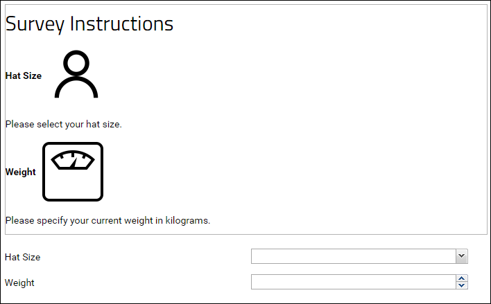
The following survey includes HTML...
{
  "survey" : {
    "layout" : "auto",
    "showCounts" : false,
    "sections" : [ {
      "questions" : [ {
        "extConfig": {
          "xtype": "panel",
          "html": "<h2>Survey Instructions</h2><p><b>Hat Size</b><img
           src='FULL_URL_TO_HAT_IMAGE'
           height='100' width='100'/></p><p>Please select your hat size.</p><p><b>Weight</b>
           <img src='FULL_URL_TO_SCALE_IMAGE'
           height='100' width='100'/></p><p>Please specify your current weight in kilograms.
           </p>"
        }
      }, {
        "name" : "HatSize",
        "caption" : "Hat Size",
        "shortCaption" : "HatSize",
        "hidden" : false,
        "jsonType" : "string",
        "inputType" : "text",
        "lookup" : {
          "schema" : "lists",
          "keyColumn" : "HatSizeName",
          "public" : true,
          "displayColumn" : "HatSizeName",
          "isPublic" : true,
          "queryName" : "HatSizes",
          "containerPath" : "/Tutorials/Survey Demo",
          "schemaName" : "lists",
          "table" : "HatSizes"
        },
        "required" : false,
        "width" : 800
      }, {
        "name" : "Weight",
        "caption" : "Weight",
        "shortCaption" : "Weight",
        "hidden" : false,
        "jsonType" : "int",
        "inputType" : "text",
        "required" : false,
        "width" : 800
      } ],
      "description" : null,
      "header" : true,
      "title" : "HatSizeAndWeight",
      "collapsible" : true,
      "defaultLabelWidth" : 350
    } ]
  }
}
...that renders as follows:
Auto Populate from an Existing Record
The following example assumes you have a List named "Participants" with the following fields:
- SSN (this is your Primary Key, which is a string)
- FirstName
- LastName
- Phone
When the List contains records, and a user enters a matching SSN number, the remaining fields in the survey will auto populate with data from the matching record.
Download the JSON code for this survey:
survey-SSNautopop.json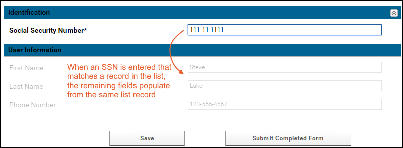
Auto Populate with the Current User's Email
When a user changes the Patient Id field, the email field is auto populated using the currently logged on user's info.
Download the JSON code for this survey:
survey-Emailautopop.json

Hidden Radio Group
When Option A is selected, a hidden radio group is shown below.
Download the JSON code for this survey:
survey-hiddenRadioGroup.json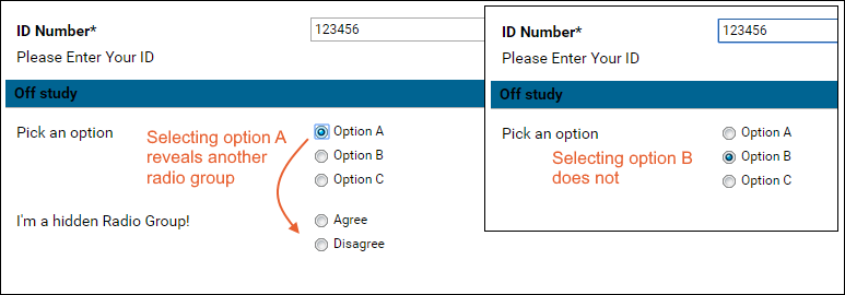
Hidden Question
A hidden question appears when the user enters particular values in two previous questions. In this example, when the user enters 'Yes' to questions 1 and 2, a 3rd previously hidden question appears.
Download the JSON code for this survey:
TwoQuestions.json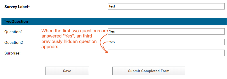
Radio Buttons / Rendering Images
The following example renders radio buttons and an image. The 'questions' object holds an 'extConfig' object, which does most of the interesting work.
The 'start' object hides the field "Survey Label" from the user.
Download the JSON code for this survey:
survey-RadioImage.json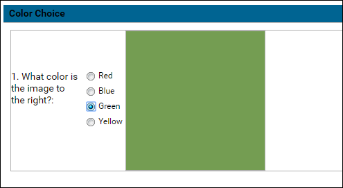
Likert Scale
The following example offers Likert scale questions as radio buttons.
Download the JSON code for this survey:
survey-Likert.json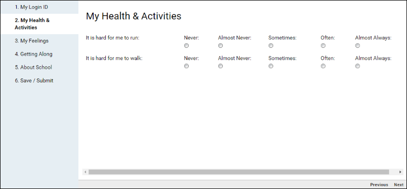
Concatenate Values
When two fields are filled in, they auto-populate another field as a concatenated value.
Download the JSON code for this survey:
survey-Concat.json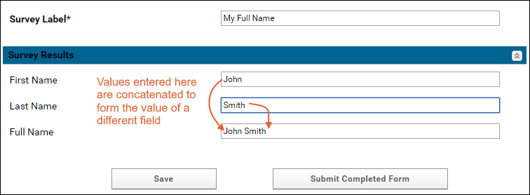
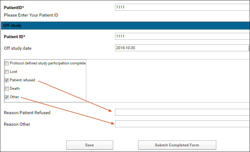
Checkbox with Conditional/Skip Logic
Two boxes pop-up when the user picks
Other or
Patient Refused. The boxes are text fields where an explanation can be provided.
Download the JSON code for this example:
survey-Skip1.json
Text Field (w/ Skip Logic)
Shows conditional logic in a survey. Different sets of additional questions appear later in the survey, depending on whether the user enters "Yes" or "No" to an earlier question.
Download the JSON code for this example:
survey-Skip2.json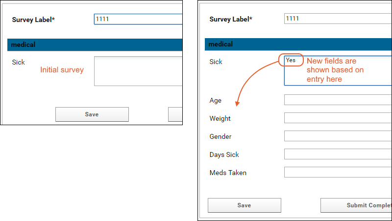
The JSON metadata example for the 'DaysSick' field, for example, looks like this:
...{
        "name" : "DaysSick",
        "caption" : "Days Sick",
        "shortCaption" : "Days Sick",
        "hidden" : false,
        "jsonType" : "string",
        "inputType" : "text",
        "required" : false,
        "width" : 800,
        "hidden": true,
        "listeners" : {
        	"change" : {
          "question" : "sick",
          "fn" : "function(me, cmp, newValue, oldValue){if (me) me.setVisible(newValue == 'Yes');} "
        }
      }
},...
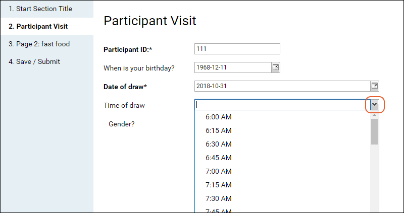
Time Dropdown
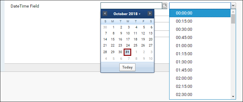
The following example includes a question answered using a dropdown to select a time in 15 minutes increments.
Download the JSON code for this example:
survey-timedropdown.json
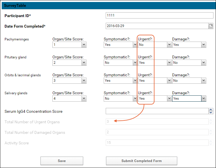
Calculated Fields
The following example calculates values from some fields based on user entries in other fields:
- Activity Score field = the sum of the Organ/Site scores, multiplied by 2 if Damage is Yes, plus the Serum IgG4 Concentration.
- Total number of Urgent Organs = the sum of Urgent fields set to Yes.
- Total number of Damaged Organs = the sum of Damaged fields set to Yes.
Download the JSON code for this example:
survey-math.json
Hiding "Default Label"
The Label field loads data into the Label field of the surveys.Surveys table. To use an autogenerated value for the Label, see below. Autogenerated values are a modified timestamp, for example, "2017-08-16T19:05:28.014Z".
Add the following start object before the sections to hide the "Label" question.
{
  "survey" : {
    "start": {
       "useDefaultLabel": true
    },
    "sections" : [{
...
Lookup from a Filtered Subset of a List
A
Combobox (Lookup) question will give the user a dropdown selector populated from a list in a given container. If you want to have the dropdown only contain a filtered subset of that list, such as only 'in use' values or some other constraint, first create a
custom grid view of that list that contains the subset you want. Then add the
viewName parameter to the combobox "lookup" definition.
For example, if you have a list named "allSOPs" with a 'retired' field (set to true when an SOP is outdated) you could create a grid view that filtered to show only those which have not been marked 'retired' and name it, for example "activeSOPs". A combobox lookup showing that list might look like this:
{
    "jsonType": "int",
    "hidden": false,
    "width": 800,
    "inputType": "text",
    "name": "lkfield",
    "caption": "Lookup Field",
    "shortCaption": "Lookup Field",
    "required": false,
    "lookup": {
       "keyColumn": "Key",
       "displayColumn": "Value",
       "schemaName": "lists",
       "queryName": "allSOPs",
       "viewName": "activeSOPs",
       "containerPath": "/Project/..."
    }
}
The user would see only the list items in that specific custom grid view.
Include Tooltips or Hints for Questions
To have a survey question show a tooltip or hover hint, you can make use of an extConfig object following this example. Include a labelAttrTpl attribute set to provide the tooltip text as the data-qtip:
"questions": [
    {
    "extConfig": {
      "width": 800,
      "xtype": "textfield",
      "name": "test",
      "labelAttrTpl": " data-qtip='This tooltip should appear on the field label'",
      "fieldLabel": "Field with tooltips"
    }
  }
],
Default Question Metadata Types
Attachment
{
    "jsonType": "string",
    "hidden": false,
    "width": 800,
    "inputType": "file",
    "name": "attfield",
    "caption": "Attachment Field",
    "shortCaption": "Attachment Field",
    "required": false
}
Checkbox (Single)
{
    "jsonType": "boolean",
    "hidden": false,
    "width": 800,
    "inputType": "checkbox",
    "name": "boolfield",
    "caption": "Boolean Field",
    "shortCaption": "Boolean Field",
    "required": false
}
Checkbox Group (ExtJS)
{
  "extConfig": {
    "xtype": "fieldcontainer",
    "width": 800,
    "hidden": false,
    "name": "checkbox_group",
    "margin": "10px 10px 15px",
    "fieldLabel": "CB Group (ExtJS)",
    "items": [{
      "xtype": "panel",
      "border": true,
      "bodyStyle":"padding-left:5px;",
      "defaults": {
        "xtype": "checkbox",
        "inputValue": "true",
        "uncheckedValue": "false"
      },
      "items": [
          {
            "boxLabel": "CB 1",
            "name": "checkbox_1"
          },
          {
            "boxLabel": "CB 2",
            "name": "checkbox_2"
          },
          {
            "boxLabel": "CB 3",
            "name": "checkbox_3"
          }
      ]
    }]
  }
}
Combobox (Lookup)
Constrain the answers to the question to the values in a specified column in a list.
{
    "jsonType": "int",
    "hidden": false,
    "width": 800,
    "inputType": "text",
    "name": "lkfield",
    "caption": "Lookup Field",
    "shortCaption": "Lookup Field",
    "required": false,
    "lookup": {
       "keyColumn": "Key",
       "displayColumn": "Value",
       "schemaName": "lists",
       "queryName": "lookup1",
       "containerPath": "/Project/..."
    }
}
Combobox (ExtJS)
{
    "extConfig": {
        "width": 800,
        "hidden": false,
        "xtype": "combo",
        "name": "comboField",
        "fieldLabel": "Combobox (ExtJS)",
        "queryMode": "local",
        "displayField": "value",
        "valueField": "value",
        "emptyText": "Select...",
        "forceSelection": true,
        "store": {
            "fields": ["value"],
            "data" : [
                {"value": "Value1"},
                {"value": "Value2"}
            ]
        }
    }
}
Date Picker
{
    "jsonType": "date",
    "hidden": false,
    "width": 800,
    "inputType": "text",
    "name": "dtfield",
    "caption": "Date Field",
    "shortCaption": "Date Field",
    "required": false
}
Date & Time Picker
{
    "extConfig": {
        "width": 800,
        "xtype": "datetimefield",
        "name": "dtfield",
        "fieldLabel": "DateTime Field"
    }
}
The resulting field provides a calendar selection option for the date and a pulldown menu for choosing the time.
Display Field (ExtJS)
{
    "extConfig": {
        "width": 800,
        "xtype": "displayfield",
        "name": "dsplfield",
        "hideLabel": true,
        "value": "Some text."
    }
}
Double (Numeric)
{
    "jsonType": "float",
    "hidden": false,
    "width": 800,
    "inputType": "text",
    "name": "dblfield",
    "caption": "Double Field",
    "shortCaption": "Double Field",
    "required": false
}
Integer
{
    "jsonType": "int",
    "hidden": false,
    "width": 800,
    "inputType": "text",
    "name": "intfield",
    "caption": "Integer Field",
    "shortCaption": "Integer Field",
    "required": false
}
Number Range (ExtJS)
{
    "extConfig": {
        "xtype": "fieldcontainer",
        "fieldLabel": "Number Range",
        "margin": "10px 10px 15px",
        "layout": "hbox",
        "width": 800,
        "items": [
            {
              "xtype": "numberfield",
              "fieldLabel": "Min",
              "name": "min_num",
              "width": 175
            },
            {
              "xtype": "label",
              "width": 25
            },
            {
              "xtype": "numberfield",
              "fieldLabel": "Max",
              "name": "max_num",
              "width": 175
            }
        ]
    }
}
Positive Integer (ExtJS)
{
    "extConfig": {
        "xtype": "numberfield",
        "fieldLabel": "Positive Integer",
        "name": "pos_int",
        "allowDecimals": false,
        "minValue": 0,
        "width": 800
    }
}
Survey Grid Question (ExtJS)
{
 "extConfig": {
     "xtype": "surveygridquestion",
     "name": "gridquestion",
     "columns": {
       "items": [{
          "text": "Field 1",
          "dataIndex": "field1",
          "width": 350,
          "editor": {
             "xtype": "combo",
             "queryMode": "local",
             "displayField":"value",
             "valueField": "value",
             "forceSelection": true,
             "store": {
               "fields": ["value"],
               "data" : [{
                 "value": "Value 1"
               }, {
                 "value": "Value 2"
               }, {
                 "value": "Value 3"
               }]
             }
          }
        },
        {
            "text": "Field 2",
            "dataIndex": "field2",
            "width": 200,
            "editor": {
              "xtype": "textfield"
            }
        },
        {
            "text": "Field 3",
            "dataIndex": "field3",
            "width": 200,
            "editor": {
              "xtype": "textfield"
             }
        }]
    },
    "store": {
        "xtype": "json",
        "fields": [
            "field1",
            "field2",
            "field3"
        ]
    }
 }
}
Survey Header/Footer Wiki
{"survey":{
   "headerWiki": {
      "name": "wiki_name",
      "containerPath": "/Project/..."
   },
   "footerWiki": {
      "name": "wiki_name",
      "containerPath": "/Project/..."
   },
   ...
}
Text Area
{
    "jsonType": "string",
    "hidden": false,
    "width": 800,
    "inputType": "textarea",
    "name": "txtfield",
    "caption": "Textarea Field",
    "shortCaption": "Textarea Field",
    "required": false
}
Customizing Autosave Options for Surveys
By default, the survey designer will autosave submissions in progress every minute (60000 milliseconds). If desired, you can disable this auto-save behavior entirely, or enable it but change the interval to something else. The relevant parameters are included in the JSON for the survey itself.
- autosaveInterval: The interval (in milliseconds) that auto-saving of the survey results will occur. The default value is : 60000.
- disableAutoSave: Set true to disable autosaving entirely. This setting takes precedence over the autoSaveInterval value and defaults to false.
A few examples follow.
To disable autosave, you would start the definition with:
{
  "survey" : {
    "layout" : "auto",
    "showCounts" : false,
    "disableAutoSave" : true,
    "sections" : [ {...
To enable autosave but double the interval (saving every 2 minutes):
{
  "survey" : {
    "layout" : "auto",
    "showCounts" : false,
    "autoSaveInterval" : 120000,
    "disableAutoSave" : false,
    "sections" : [ {...
Other Examples
Download these examples of whole surveys:


 Download the JSON code for this example: survey-Skip1.json
 The JSON metadata example for the 'DaysSick' field, for example, looks like this:
