A line plot tracks the value of a measurement across a horizontal scale, typically time. It can be used to show trends alone and relative to other individuals or groups in one plot.
Create a Line Plot
- Navigate to the data grid you want to visualize. We will use the Lab Results dataset from the example study for this walkthrough.
- Select (Charts) > Create Chart. Click Line.
- The columns eligible for charting from your current grid view are listed.
- Select the X Axis column by drag and drop, here "Date".
- Select the Y Axis column by drag and drop, here "White Blood Count".
- Leave the other fields unset/at their defaults for now.
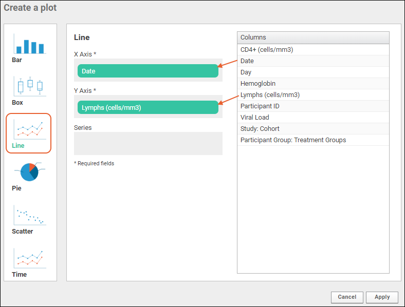
- Only the X and Y Axes are required to create a basic line plot. Other options will be explored below.
- Click Apply to see the basic plot.
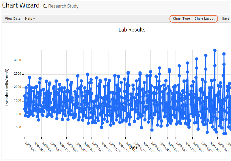
This basic line chart plots a point for every "Y-axis" value measured for each "X-axis" value, as in a
scatter plot, then draws a line between them. When all values for all participants are mixed, this data isn't necessarily useful. Next, we might want to separate by participant to see if any patterns emerge for individuals.
You may also notice the labels for tickmarks along the X axis overlap the "Date" label. We will fix that
below after making other plot changes.
Line Plot Customizations
Customize your visualization using the
Chart Type and
Chart Layout links in the upper right.
- Chart Type reopens the creation dialog allowing you to:
- Change the X or Y Axis column (hover and click the X to delete the current selection).
- Select a Series column (optional). The series measure is used to split the data into one line per distinct value in the column.
- Users of Premium Editions can change the type of Trendline if desired. Learn more below.
- Note that you can also click another chart type on the left to switch how you visualize the data with the same axes when practical.
- For this walkthrough, drag "Participant ID" to the Series box.
- Click Apply.
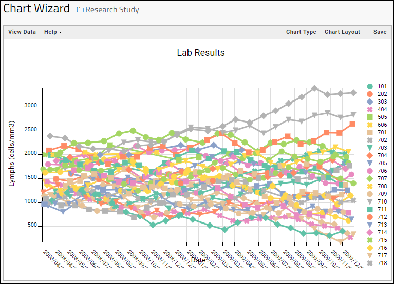
Now the plot draws series' lines between values for the same subject, but is unusably dense. Let's filter to a subset of interest.
- Click View Data to see and filter the underlying data.
- Click the ParticipantID column header and select Filter.
- Click the "All" checkbox in the popup to unselect all values. Then, check the boxes for the first 3 participants.
- Click OK.
- Click View Chart to return. Now there are 3 lines showing values for the 3 participants.
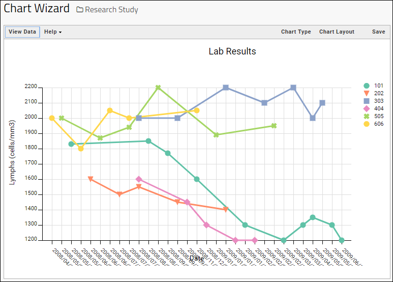
Add a Second Y Axis
To plot more data, you can add a second Y axis and display it on the right.
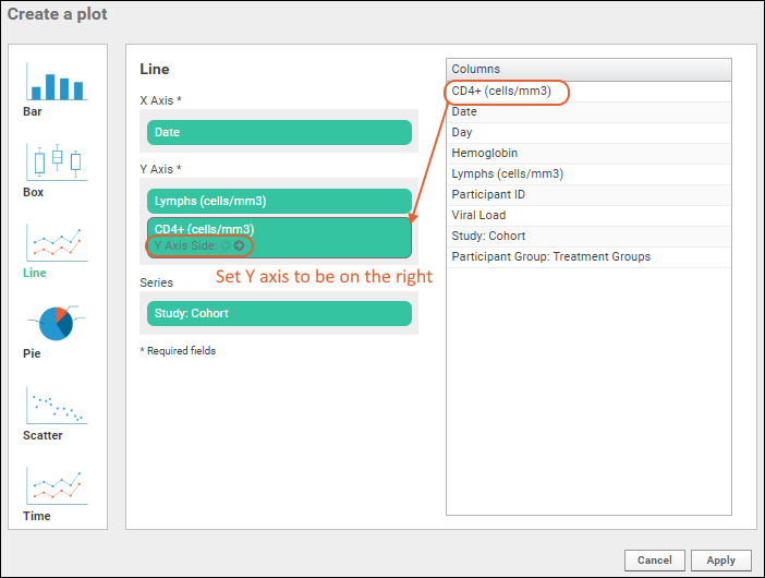
- Click Chart Type to reopen the editor.
- Drag the "CD4" column to the Y Axis box. Notice it becomes a second panel and does not replace the prior selection (Lymphs).
- Click the (circle arrow) to set the Y Axis Side for this measure to be on the right.
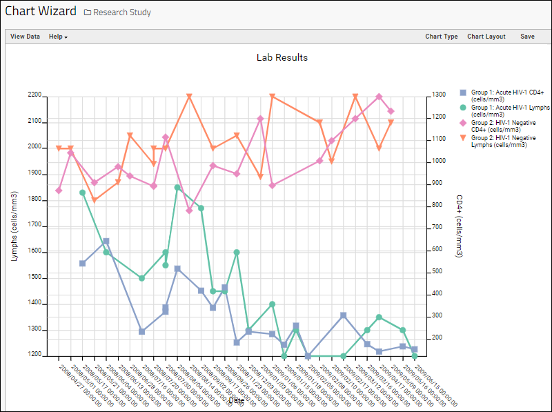
- You can see the trend line for each measure for each cohort in a single plot.
Change Chart Layout
The
Chart Layout button offers the ability to change the look and feel of your chart.
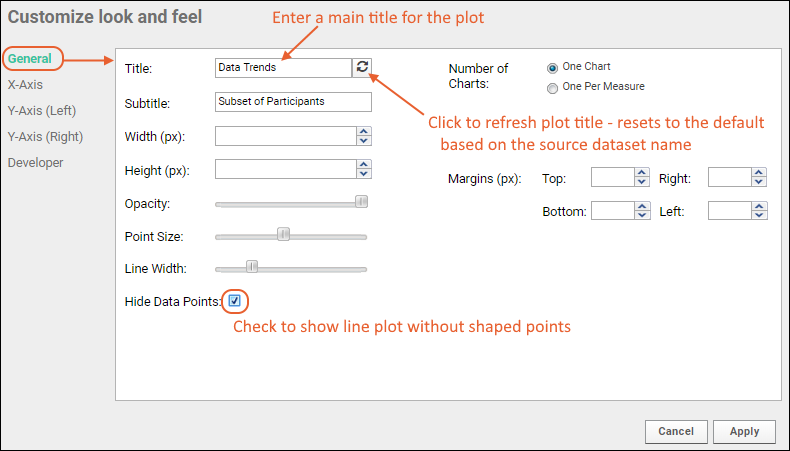
There are four tabs:
- General:
- Provide a title to display on the plot. The default is the name of the source data grid.
- Provide a subtitle to display under the title.
- Specify a width and height.
- Control the point size and opacity, as well as choose the default color, if no "Series" column is set.
- Control the line width.
- Hide Data Points: Check this box to display a simple line instead of showing shaped points for each value.
- Number of Charts: Select whether to show a single chart, or a chart per measure, when multiple measures are defined.
- Margins (px): If the default chart margins cause axis labels to overlap, or you want to adjust them for other reasons, you can specify them explicitly in pixels. Specify any one or all of the top, bottom, left, and right margins here.
- X-Axis:
- Label: Change the display label for the X axis (notice this does not change which column provides the data). Click the icon to restore the original label based on the column name.
- Y-Axis:
- Label: Change the display label for the Y axis as for the X axis.
- Scale Type: Choose log or linear scale for the Y axis.
- Range: For the Y-axis, the default is Automatic across charts. Select Automatic Within Chart to have the range based only on this chart. You can also select Manual and specify the min and max values directly.
- Developer: Only available to users that have the "Platform Developers" site role.
- A developer can provide a JavaScript function that will be called when a data point in the chart is clicked.
- Provide Source and click Enable to enable it.
- Click the Help tab for more information on the parameters available to such a function.
- Learn more in this topic.
Adjust Chart Margins
When there are enough values on an axis that the values overlap the label, or if you want to adjust the margins of your chart for any reason, you can use the chart layout settings to set them. In our example, the date display is too long for the default margin (and overlaps the label) so before publishing, we can improve the look.
- Observe the example chart where the date displays overlap the label "Date".

- Open the chart for editing, then click Chart Layout.
- Scroll down and set the bottom margin to 85 in this example.
- You can also adjust the other margins as needed.
- Note that plot defaults and the length of labels can both vary, so the specific setting your plot will need may not be 85.
- Click Apply.

- Click Save to save with the revised margin settings.
Trendline Options (Premium Feature)
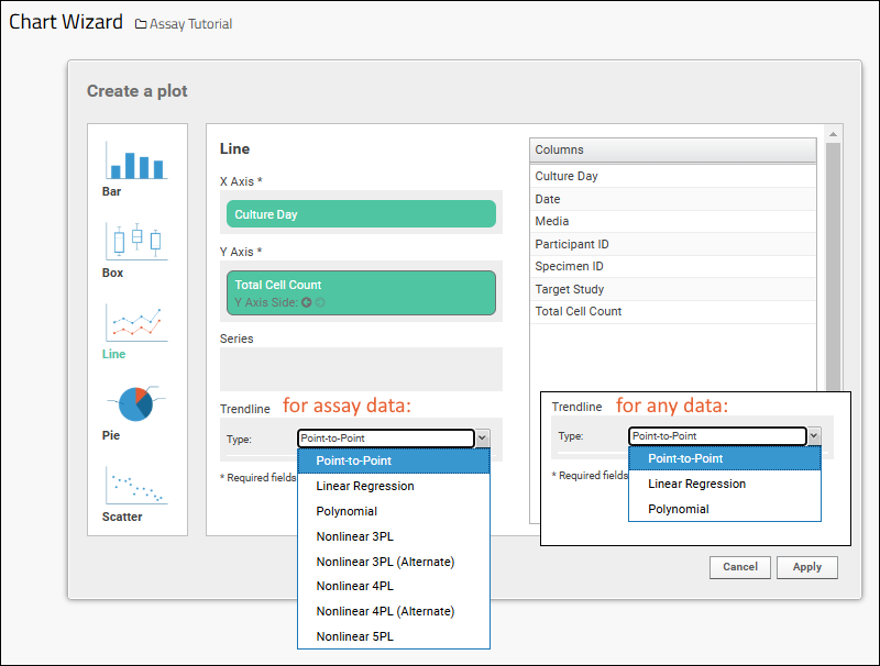
The trendline shown in a line plot defaults to being point-to-point, and is adjustable to other options in some situations. Trendline options are available in Premium Editions when creating a line plot in the LabKey Server interface, and conditionally available in the LabKey LIMS and Biologics LIMS products when a numeric field is selected for the X axis.
Reopen the
Chart Type editor to see if the option is available and select the desired trendline if so. Any data can use the first three basic types. The non-linear trendline options are only available for tables and queries in the
assay schema.
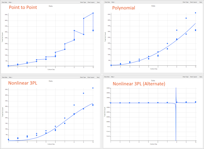
- Point-to-Point (default)
- Linear Regression
- Polynomial
- Nonlinear 3PL
- Nonlinear 3PL (Alternate)
- Nonlinear 4PL
- Nonlinear 4PL (Alternate)
- Nonlinear 5PL
The same data presented with four different trendline options:

- When a trendline type is selected it will apply to each distinct series, or all data points if no series variable is selected.
- Nonlinear trendline options will conditionally show asymptote min/max inputs, when available.
- Hovering over a trendline will show the stats and curve fit parameters.
- Saving a line chart with a trendline type set will retain that selection and show on render of the chart.
Save and Export Plots
- When your plot is finished, click Save.
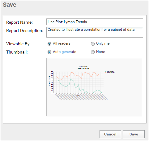
- Name the chart, enter a description (optional), and choose whether to make it viewable by others. You will also see the default thumbnail which has been auto-generated, and can choose whether to use it. As with other charts, you can later attach a custom thumbnail if desired.
Once you have saved a line plot, it will appear in the
Data Browser and on the
(charts) menu for the source dataset. You can manage metadata about it as described in
Manage Data Views.
Export Chart
Hover over the chart to reveal export option buttons in the upper right corner:

Export your completed chart by clicking an option:
- PDF: generate a PDF file.
- PNG: create a PNG image.
- Script: pop up a window displaying the JavaScript for the chart which you can then copy and paste into a wiki. See Tutorial: Visualizations in JavaScript for a tutorial on this feature.
Related Topics

 There are four tabs:

