The Panorama QC folder is designed to help labs perform QC of their instruments and reagents over time. Runs are uploaded using the data pipeline or imported directly from skyline.
QC Plots Web Part
The
QC Plots webpart shows one graph per precursor. The web part header allows yoou to specify a number of options, including selecting one or more type of plot using checkboxes. Hover over a plot name to learn more. This topic uses the default Levey-Jennings plot to illustrate features.
QC Plot Types
- Levey-Jennings: (Default) Levey-Jennings plots plot quality control data to give a visual indication of whether a laboratory test is working well. The distance from the mean (expected value) is measured in standard deviations (SD).
- Moving Range (MR): Plots the moving range over time to monitor process variation for individual observations by using the sequential differences between two successive values as a measure of dispersion.
- CUSUMm: A CUSUM plot is a time-weighted control plot that displays the cumulative sums of the deviations of each sample value from the target value. CUSUMm (mean CUSUM) plots two types of CUSUM statistics: one for positive mean shifts and one for negative mean shifts.
- CUSUMv: The CUSUMv (variability or scale CUSUM) plots two types of CUSUM statistics: one for positive variability shifts and one for negative variability shifts. Variability is a transformed standardized normal quantity which is sensitive to variability changes.
QC Plot Features
Metrics
Select the metric to plot using the pulldown menu in the web part header. Each type of plot can be shown for the following metrics:
- Full Width at Base (FWB)
- Full Width at Half Maximum (FWHM)
- Light/Heavy Ratio (when data is available)
- Mass Accuracy
- Peak Area
- Retention Time
- Transition/Precursor Area Ratio
- Transition/Precursor Areas

- Metric: Select the desired metric from the pulldown.
- Date Range: Default is "All dates". Other options range from last 7 days to last year, or you can specify a custom range.
- Plot Size: When multiple plots are selected, you will have the following options:
- Small: Display 2 plots across the page.
- Large: Show full width plots, one per row.
- QC Plot Type: Check one or more boxes for plot type. Options outlined above.
- Y-Axis Scale: Linear or logarithmic.
- Group X-Axis Values by Date: Check this box to scale acquisition times based on the actual dates. When this box is not checked, acquisition times are spaced equally, and multiple acquisitions for the same date will be shown as distinct points.
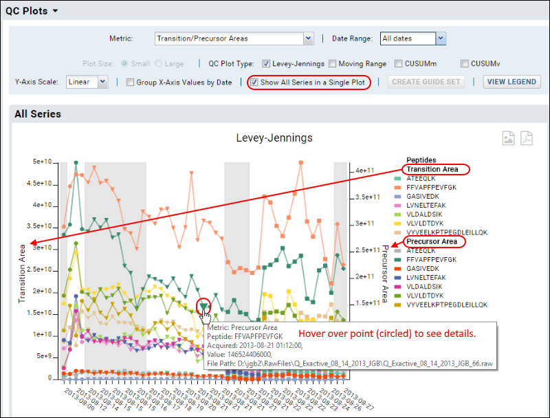
- Show All Series in Single Plot: Check this box to show all fragments in one plot.
Click the
Create Guide Set button to
create a guide set.
Click
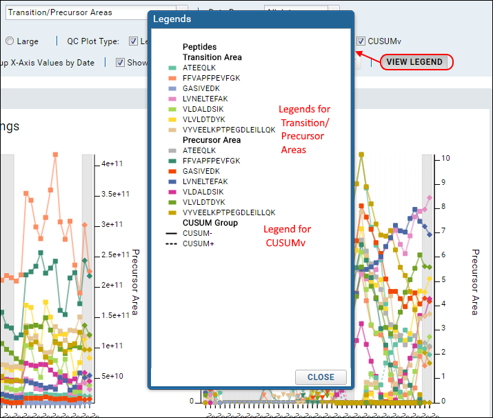
View Legend to see
legends for all plot types shown.
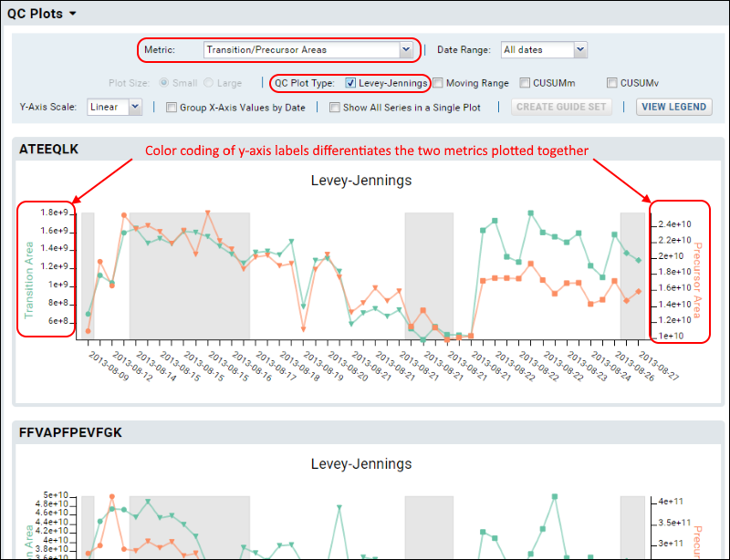
Transition/Precursor Areas
To show both precursor and fragment values in the same plot, select the metric option
Transition/Precursor Areas.
The plot is more complex when all fragments are shown. Use the legend for reference, and you can also hover over any point to see a tool tip with more information about that point.
View Legend
To see the legends used for all plots click
View Legend.
Export a Plot
You can export any of the plots by hovering to expose the buttons in the upper right, then clicking the icon for:
- PNG: Export to a PNG image file.
- PDF: Export as a PDF document.
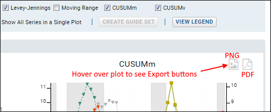
Exported plots will always include the legends, whether they appear on the display plot or not.
QC Metric Settings Persistence
The next time the user views the plots on the dashboard, they will see the same metric they were most recently viewing. Persisted values are metric, y-axis scale, group x-axis checkbox, and show single plot checkbox. The start and end dates previously selected do not persist, as it is most useful to come back to the full range.
Small Molecule Data
The same Levey-Jennings, MR, CUSUM, and Pareto plot features apply to both proteomics (peptide/protein) data and small molecule data. Data from both types may be layered together on the same plot when displaying plots including all fragments. Counts of outliers and sample files include both types of data.
When visualizing small molecule data, you are more likely to encounter warnings if the number of precursors exceeds the count that can be usefully displayed. This screenshot shows an example plot with small molecule data.
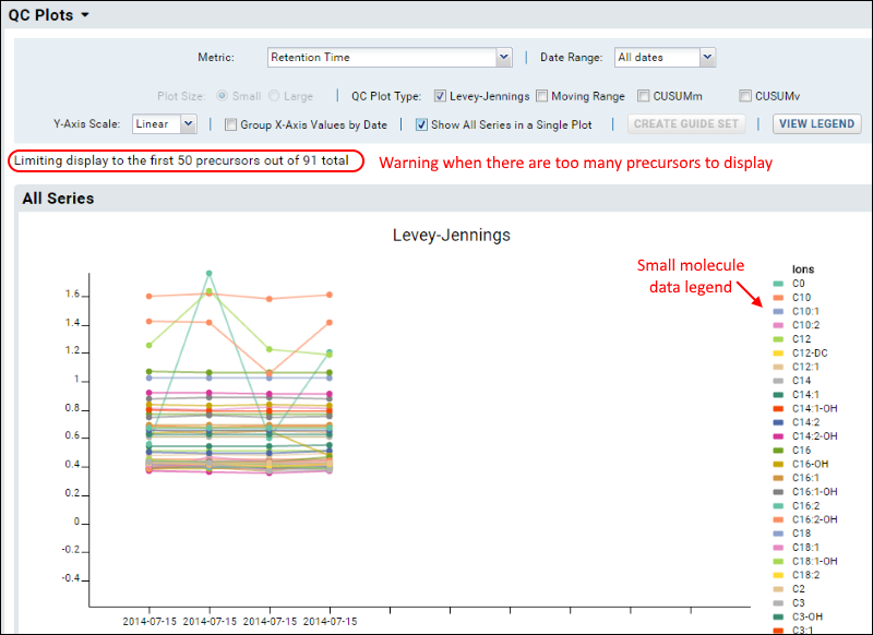
Note that the legend for this illegibly-dense plot does not list all 50 precursors.
Related Topics
